For me, I think font cartridges are my favorite! I love finding the perfect mix of fonts to go with whatever project I am creating. I love projects that mix and match fonts to show the perfect mood of that particular project.
There are a few tricks to know about using fonts and it usually starts with how they will be used on your project. Typically when you use the Paper Saver option on the keypad, the “word” that you will be cutting will be rearranged to take less space on your mat. This is a great option when you will be gluing the letters to a project or will be applying each letter to a banner or each to a different item. There are times when you will want to have your word cut all together, as you entered it. Perhaps you will be using the negative as a stencil or as a certain element on your project. Or in the event that you are cutting on Iron-on (HTV) or Vinyl, you may want your word to be cut as it was entered to make it easier to apply to your project using transfer tape or the clear backing on the Iron-on material. And if this is the case, do you need to add in a space anywhere?
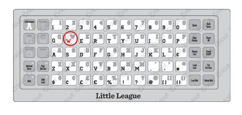
All of the letters within a font set are cut in proportion to the Key Height Character. This is usually the tallest letter within the font set. In the font sets, and some shape sets, you will see the Key Height Character shown in red in the cartridge handbook.
If you don’t want the letters to be cut in proportion to the Key Height Character you would select the Real Dial Size button on the keypad. Selecting the Real Dial Size will cut all letters out at the literal size selected on the Size Dial.
The smallest size you can select on the Size Dial is 1”. Keep in mind that your Key Height Character will be the letter it will be going off of. So other letters will cut in proportionate to that letter if you do not have the Real Dial Size selected.

Some font cartridges have “Creative Features” where it will place the letter inside of a tag or shape. They will also come with a “Foundation” shape as well which is a solid version of the Creative Feature shape. These are fun to layer with different colors to add a whole new element to your project!

Tip: If you are wanting letters smaller than the 1” on the Size Dial, If the cartridge has a Creative Feature (like the one shown above), you can turn on the Creative Feature, set your size to 1” - the tag or Creative Feature will cut at 1” and the letter will come out smaller. It would be harder to get an exact size of your letter but a fun way to create some smaller letters if you need them for your card or project!
Fonts also come with a Shadow Feature. The Shadow will give you dimension and make your letters stand out. Tip: Using just the Shadow feature by itself creates a chunky version of the original font.
You can see that fonts can be very versatile and add a lot of personality to your project. I hope this inspires you to try something new with the fonts in your cartridge library.